My Design Work
A few weeks back, somebody made a comment about being interested in seeing the class diagrams for some specific, complicated piece of the game. My response was that I’m following Scrum, which de-emphasizes design documents like formal UML, and emphasizes working code instead. That’s not to say that there’s no place for UML in Scrum. Sometimes there is.
But instead, it’s more about getting to working code and a high quality product as quickly as possible. If the best way to do that is UML, you do it. If it’s some other form, you do that instead.
Since I’m just a lone developer, and because the time between design and implementation is fairly short for most things, UML is overkill in most cases.
I thought some of you may find it interesting to see a glimpse into what my design stage is usually like.
Between yesterday and today, I’ve come to a pretty clear conclusion that the way I was structuring my UI controls in code was lacking in the area of how controls (such as a button, label, image, etc.) are arranged, relative to their parent. As I was doing other UI related things, I was just doing whatever made sense at the time, and I never had a “grand vision” for how these should work. In particular, whether a control’s position was relative to the screen, or relative to its parent. For the most part, up until now, I was dumping in global screen coordinates. This was doable because most things were kind of at the top level, sitting just on top of the screen, with the exception of menu items in the menu, whose positions and sizes were managed by the menu itself anyway.
But after doing the mockups over the last couple of days, and after starting to implement some of it, I can see that this just isn’t going to work, and it was time to get things straightened out. If I didn’t, they’d only get worse.
When it comes to designing something, my first step is to sit down and figure out what exactly needs to be accomplished. Sometimes this is on the computer, sometimes it’s on paper, but my favorite way is on a whiteboard. I have one in my little office room in my house. (It’s a spare bedroom.) Rather than buying one for $100, I went to the local hardware store and bought MarkerBoard (I think that’s a brand name–generic might be “shower board”) and some heavy duty Command Strips and hung it up. Throw in a few whiteboard markers and an eraser, and you can get the whole thing for about $20-$30.
So I go to the whiteboard and write down what I need to accomplish, then I just start drawing out ideas. The nice thing about a computer and a whiteboard is that you can quickly remove the things that you don’t like or that don’t work. The nice thing about paper and a whiteboard is that it’s easy to draw diagrams, text, math, code… pretty much anything you want. Since whiteboards get the best of both worlds, I use it when I can.
Eventually, my ideas coalesce around (what I hope will be) a high quality design. Depending on what I’ve designed, I’ll then either grab my computer and type up what I wrote on my project’s wiki, or I’ll take a photo of it with my phone and email it to myself and save it on my computer.
An example from today:
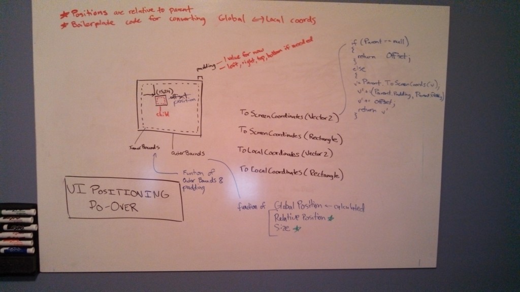
In most cases, I have this whiteboard sitting in front of me as I work on the code that implements it. The example above is probably cleaner than most. It was kind or cherry-picked to find a good one to show. Some of the others end up with arrows all over the place.
I’m curious if anyone else out there uses a whiteboard (or something similar) to do designing like this. Any thoughts?